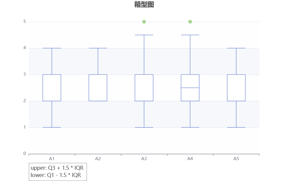
Box Plot
A box chart is a chart used to display data distribution and outliers. It consists of a box and two lines, where the box represents the median and quartile range of the data, while the lines represent the minimum and maximum values of the data. Box plots can help us observe the central trend, dispersion, and outliers of data, and compare the distribution of data under different groups or conditions.
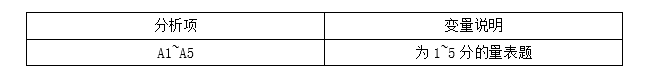
Data description:
Background description:
The main part of the box diagram is a rectangular box, representing the middle 50% range of the data, with the middle digits located inside the box. The background description can explain the meaning of the box, including the quantile positions at the top and bottom of the box, as well as the meaning of the height and width of the box. Whiskers on a box chart typically represent the range of data. The background description can explain the calculation method of tentacles, such as using the maximum, quantile, or other statistics to determine the length of tentacles. In addition, it can also indicate the labeling method of possible outliers or outliers.
The analysis results are as follows:
关注微信公众号发送【示例数据】获取SPSSMAX练习示例数据。