Bubble Chart
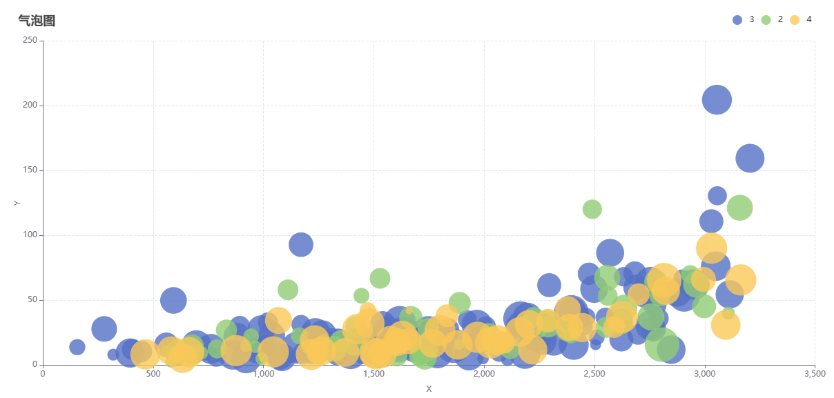
A bubble chart is a chart used to display the relationship between three variables. It is similar to a scatter plot, but the size of each point represents the value of the third variable. Bubble charts can help us observe the correlations, trends, and patterns among three variables, and provide more comprehensive data analysis.
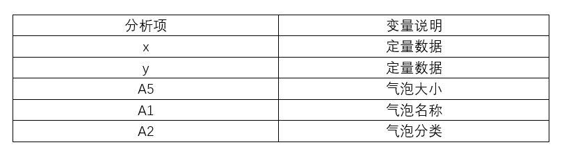
Data description:
Background description:
Bubble charts can display trends and correlations between different variables. The horizontal and vertical axes in a bubble chart typically represent two quantitative variables. The background description should provide the definition, units, measurement methods, and their position in the chart for each variable.
The analysis results are as follows:
关注微信公众号发送【示例数据】获取SPSSMAX练习示例数据。