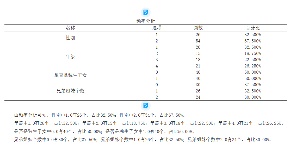
Frequency Analysis
Frequency statistical analysis refers to the number of times an event occurs within a certain period of time, usually used to describe the occurrence of a certain behavior, phenomenon, or event. The frequency can be determined through statistical data or observation records. 【 Restricted data type: classified data 】
For the given options, frequency, and percentage, the following is a detailed explanation of each indicator:
1. Option: Option refers to the possible values or categories of a variable. They can be text, numbers, or symbols, representing a specific attribute or category.
2. Frequency: Frequency refers to the number of times an option appears in the dataset. It is used to indicate the frequency or quantity of an option's occurrence.
3. Percentage: The percentage is the proportional value obtained by dividing the frequency by the total number and multiplying it by 100. It represents the relative proportion of an option in the dataset. Percentages can provide us with a more intuitive understanding of the importance or distribution of each option in the overall picture.
By counting the frequency of options and calculating percentages, we can obtain information about the distribution of variables and data characteristics. These indicators can help us judge the tendency of data, compare the importance of different options, or detect the specificity of certain options.
The analysis table is as follows:
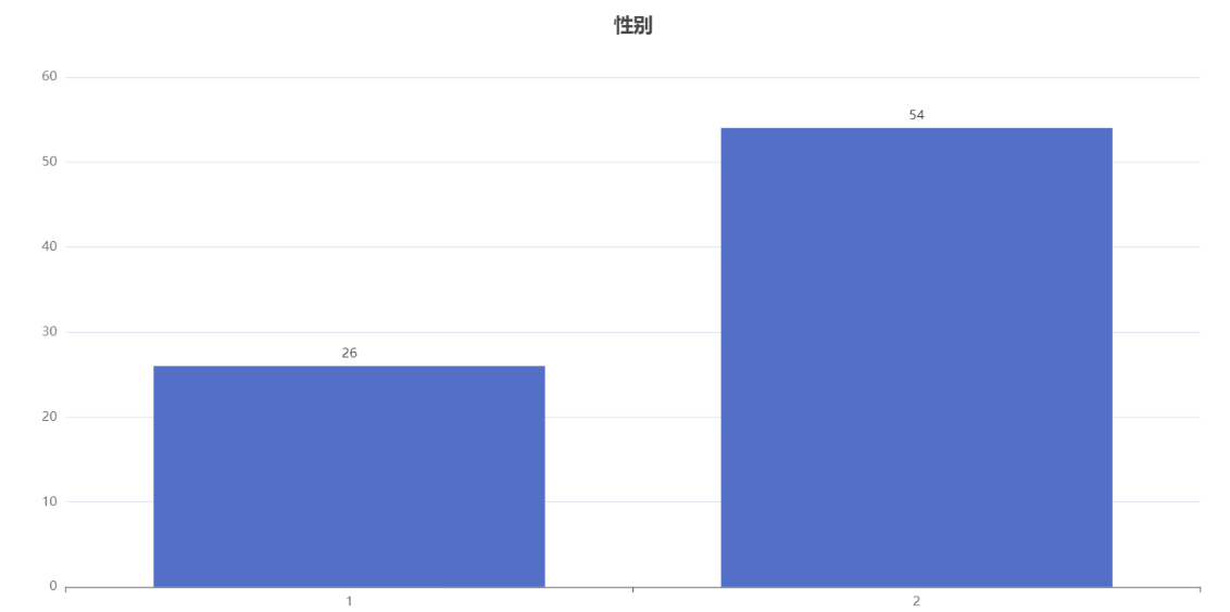
A bar chart is a common data visualization method used to compare data between different categories or groups. It consists of a series of vertical or horizontal rectangular bars, each with a length that represents the size of the data.
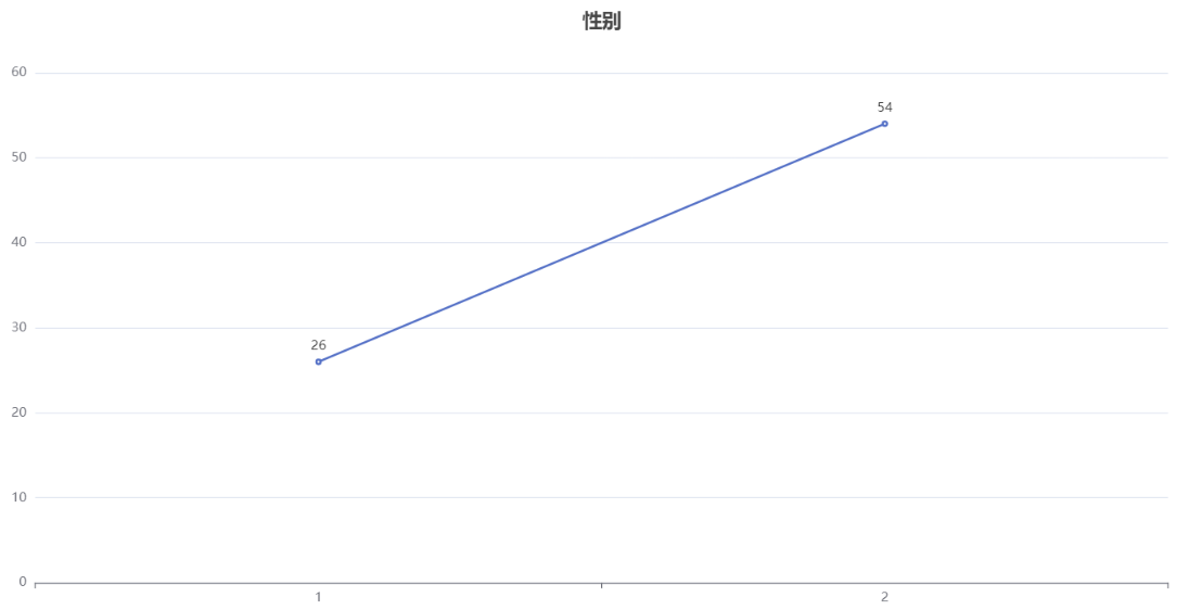
Line chart is a common data visualization method used to display the trend of data over time, sequence, or other continuous variables. It consists of one or more polylines, each representing the trend of different variables changing with the change of independent variables.
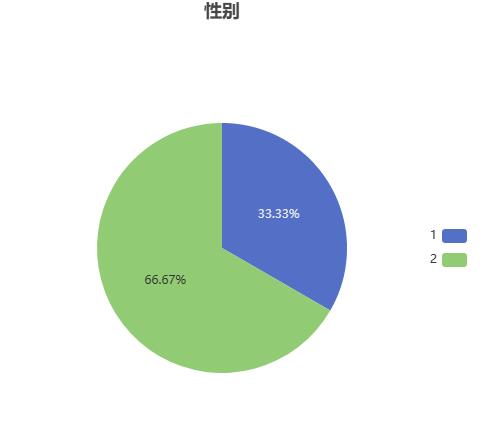
Pie charts are a commonly used data visualization method used to display the relative proportion or percentage of data. It consists of a circular area and multiple sectors, with the size of each sector representing the proportion of data occupied.
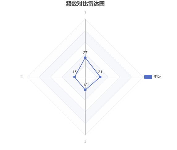
Radar chart is a data visualization method used to compare the relationships between multiple variables or options. It consists of a center point and multiple equidistant axes, each axis representing a variable, and the length extending from the center point to different directions represents the value of the variable.
You can choose different graphics according to your own needs to display the basic distribution of data.
关注微信公众号发送【示例数据】获取SPSSMAX练习示例数据。