Kendall Related
The Kendall coefficient is defined as n statistical objects of the same class sorted by specific attributes, while other attributes are usually unordered. The ratio of the difference between concordant pairs and discordant pairs to the total logarithm (n * (n-1)/2).
Background description:
When conducting correlation analysis, we usually focus on the degree of correlation between variables. This can help us understand the relationships between variables, thereby better interpreting the data and predicting future trends. In this question, we conducted a correlation analysis on the two variables A1~A5, with the aim of studying whether there is a significant correlation between them- 1 to 1.
The analysis results are as follows:
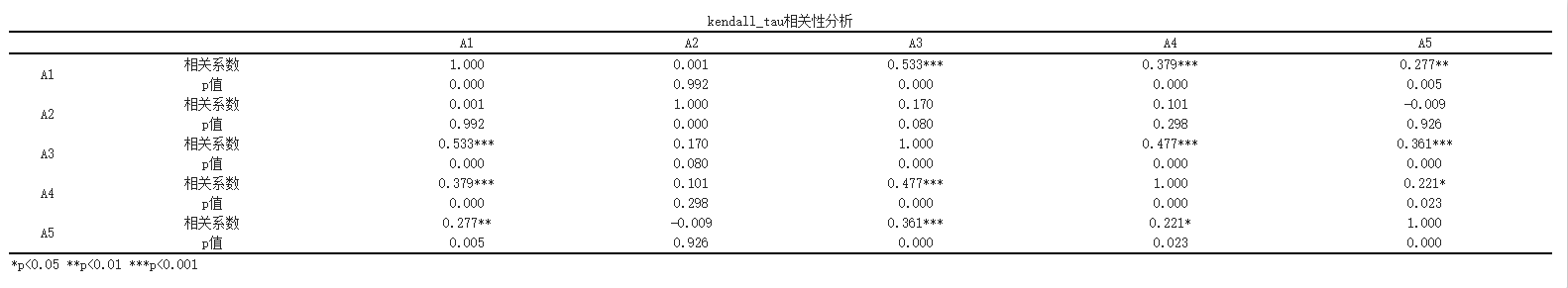
By Kendall_ Tau correlation analysis shows that
The correlation analysis between A1 and A2 was not significant and there was no significant correlation (r=0.001, p=0.992>0.05). The correlation analysis between A1 and A3 showed a significant positive correlation (r=0.533, p=0.000<0.05). The correlation analysis between A1 and A4 showed a significant positive correlation (r=0.379, p=0.000<0.05). The correlation analysis between A1 and A5 showed a significant positive correlation (r=0.277, p=0.005<0.05). The correlation analysis between A2 and A3 was not significant and there was no significant correlation (r=0.170, p=0.080>0.05). The correlation analysis between A2 and A4 was not significant and there was no significant correlation (r=0.101, p=0.298>0.05). The correlation analysis between A2 and A5 was not significant and there was no significant correlation (r=-0.009, p=0.926>0.05). The correlation analysis between A3 and A4 showed a significant positive correlation (r=0.477, p=0.000<0.05). The correlation analysis between A3 and A5 showed a significant positive correlation (r=0.361, p=0.000<0.05). The correlation analysis between A4 and A5 showed a significant positive correlation (r=0.221, p=0.023<0.05).
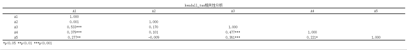
At the same time, SPSSMAX also provides another format of correlation analysis table.
Thermal map output for correlation analysis:
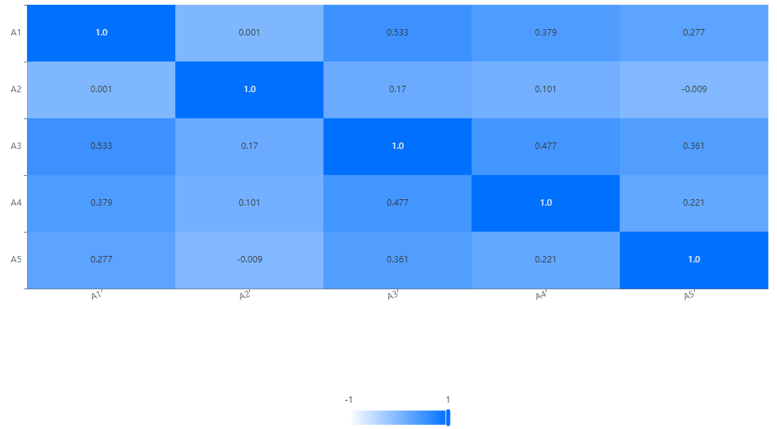
In the correlation heat map, each variable is represented as a row and column in the chart. Through the cells on the diagonal, we can see the correlation between each variable and itself, which is always 1 because a variable is completely related to itself.
The cells on non diagonal lines reflect the correlation between different variables. The depth of the color indicates the strength of the correlation, usually represented by a color gradient. Usually, darker colors (such as dark blue) indicate a strong positive correlation, while lighter colors (such as light blue) indicate a strong negative correlation. The middle color (such as white or light yellow) indicates weak or close to zero correlation.
Reference:
[1]林卓琛,张晋昕.基于非参数相关系数的心肌病自动诊断[J].中国医学物理学杂志,2021,038(1):80-85
[2]王彦敏,刘天浩,董晨磊,姚福艳.基于信息熵权—复相关系数法的煤层底板突水危险性评价[J].现代矿业,2021,037(2):173-177
[3]李玉水.随机变量的Kendall相关系数的推广[J].莆田学院学报,2009,016(005):15-17
关注微信公众号发送【示例数据】获取SPSSMAX练习示例数据。