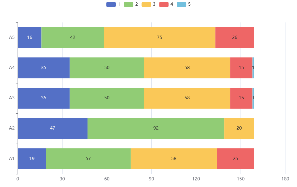
Stacked Bar Chart
Stacked bar chart is a chart used to display the distribution and comparison of data between multiple categories or groups. It consists of multiple horizontal bars, each representing a category or group, and the height of the bars represents the quantity or proportion of data. Stack data from different categories or groups together to display the overall and distribution of each category. Stacked bar charts can help us observe the overall and relationships between various parts of data, and compare differences between different categories or groups.
Data description:
Background description:
The bars in a stacked bar chart represent multiple categorical variables and display the proportions between each categorical variable in a stacked manner. Each stacked section in a stacked bar chart represents the relative proportion of each categorical variable in the total amount. Used to display trends and changes between different categorical variables, background explanations can provide explanations of trends. This can include describing the changes in specific categorical variables, such as the reasons for increase or decrease, or the relationships between different categorical variables.
The analysis results are as follows:
关注微信公众号发送【示例数据】获取SPSSMAX练习示例数据。